At Finnovista, we are working on collaborating with the ecosystem to develop result-driven innovation and to continue exploring new solutions that will enable us to boost the potential of our organisation and our corporate clients. That’s why we have relaunched the Finnovista brand with a brand new image that reinforces our mission while maintaining our essence.

We want to share with everyone how we have worked on this new brand, as a prelude to all the changes we are about to communicate in the coming weeks, such as a new offer of virtual networking activities, remote programs for our startups and other innovations activities. With this learning, we can motivate other organizations to follow the transformation that we have undertaken ourselves.
The essence of Finnovista
At Finnovista, we have taken advantage of these past weeks of social distancing to rethink our strategy and prepare for the challenges ahead. In the Finnovista brand, we have found many elements which we are proud of and on which we want to build a new response to a new reality.
Finnovista is an impact organization that empowers the transformation of the financial and insurance industry, building bridges of collaboration between startups and companies to create a better world.
To communicate the meaning of Finnovista, we continue to use our “dandelion” as an identifying image of our identity. It’s simple and clean lines support an easy deployment in digital environments, which spreads or distributes innovation in the ecosystem.
Its organic morphology inspires our personality and its natural character allows us to bring a fresh air of dreams and illusions into the financial sector. Our stakeholders are part of this digital transformation, which we achieve through the use of new technologies and innovation in the sector. Finnovista is, at the same time, the network and the connection point for people, companies, and new ideas, which allow further development in the new way of understanding finance and insurance.
More inclusive colors
As part of this renewal work, one of the changes has to do with the proposal of the new colour palette, which brings much more brightness through more dynamic and lively shades that connect with technology, in the sense that it is an area where changes happen at great speed.
With these new colors, we wanted to make a strong statement of this journey that we undertook 7 years ago, and that we now reinforce with our value proposition, to continue enhancing the Fintech and Insurtech ecosystems in Latin America and Spain. We wanted to find the balance of all the elements already presented, thus showing the perfect combination of technological innovation, large corporations, and the entrepreneurial world.

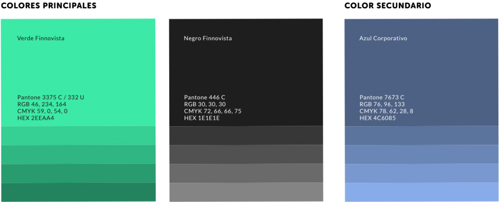
The main palette reflects our brand identity; it is defined by two main colours, creating a high contrast between both, Finnovista green and grey, which are complemented by a third secondary colour to create harmony in the use of other elements.

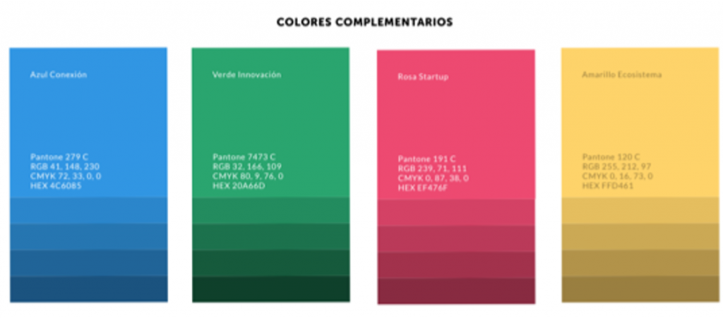
The essence of Finnovista and the adaptation of new trends are reflected by this new base of complementary colours. Blue is reinforced by green, while pink gives a new feeling and adds a feminine glow to these shades, just like all the professional women on our team. Yellow and blue are included in the palette to reiterate the roots of our brand.
The change of rhythm in the industry, the struggle for gender equality in the market, the democratization of services, and the great efforts of the ecosystem to improve financial inclusion we wanted to reflect with this new palette of complementary secondary colors.

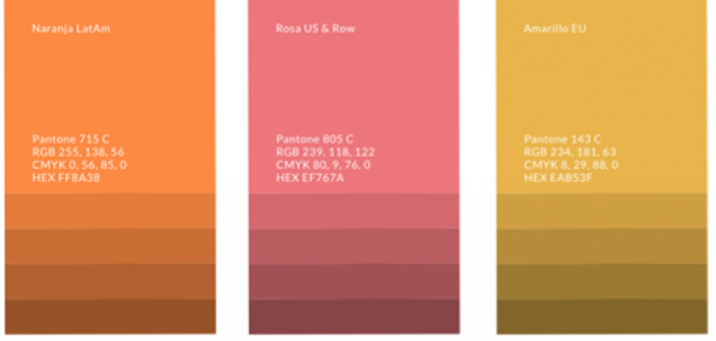
Taking up again the variation of yellow and pink, we bring one more surprise: orange makes its appearance in this change of Finnovista’s corporate identity, showing that something new is about to happen. With them, we represent categories, regions, and other elements of interest to our community within the new Finnovista website.
An expanding impact

We will continue to give prominence to our Sans Museum typography, but we have complemented the range we use with second typography; Nunito, which is characterized by being a well-balanced type of the sans serif family with rounded terminals that, in addition to presenting high legibility, transmits modernity, strength, dynamism, power, and actuality.
A small gesture can cause a great transformation in the ecosystem. To inspire our partners, the innovators who are part of Finnovista’s programs in various ways, we have recreated new visual elements, which simulate the effect of each of our projects and their transformative impact on the ecosystem.
On the other hand, and with a view to adapting to the new forms of communication and transmedia languages, where the visual and the text share spaces, we have created a new range of icons that you will soon see accompanied by our reports, blog posts and infographics, among others.
We have listened to the ecosystem and to our clients, whom now not only seek to innovate but to do so by coming out much stronger in this new normality. This new website shows 7 years of innovation together with all of you. At Finnovista we want to keep promoting innovation as the seed of all answers.
We invite you to discover what’s new on Finnovista website!

